Google charts would be very useful to enhance the Oracle BI Application deliverables. The Google Visualization API allows developer to create charts and reporting applications over structured data and helps integrate these directly into your website or on a Gadget. You can find more information on Google chart by using following link
One of the important charts which would be useful for BI Apps Spend and Procurement to demonstrate analysis is ‘Heat Map’; it is a perfect representation of using size (Invoice Amount) and color ( Invoice Count) variations. This blog is an attempt to demonstrate how Google Organization charts can be embedded into an OBIEE analysis.
Report

Narrative View
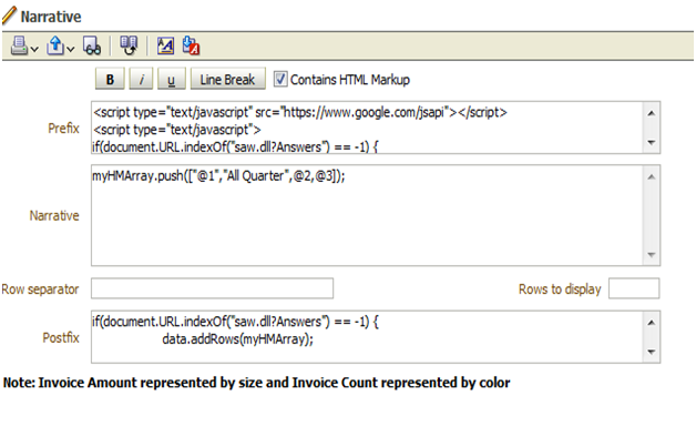
Prefix
|
<script type="text/javascript" src="https://www.google.com/jsapi"></script>
<script type="text/javascript">
if(document.URL.indexOf("saw.dll?Answers") == -1) {
google.load("visualization", "1", {packages:["treemap"]});
google.setOnLoadCallback(drawHMChart);
}
function drawHMChart() {
if(document.URL.indexOf("saw.dll?Answers") == -1) {
// Create and populate the data table.
var data = new google.visualization.DataTable();
data.addColumn('string', 'Quarter');
data.addColumn('string', 'Parent');
data.addColumn('number', 'InvoiceAmt');
data.addColumn('number', 'InvoiceNum');
myHMArray=[];
myHMArray.push(["All Quarter",null,0,0]);
}
|
Narrative
|
myHMArray.push(["@1","All Quarter",@2,@3]);
|
Row separator
|
Nil
|
Rows to display
|
Nil
|
Postfix
|
if(document.URL.indexOf("saw.dll?Answers") == -1) {
data.addRows(myHMArray);
// Create and draw the visualization.
var tree = new google.visualization.TreeMap(document.getElementById('div_Heatmap'));
tree.draw(data, {
minColor: '#f00',
midColor: '#ddd',
maxColor: '#0d0',
headerHeight: 15,
fontColor: 'black',
showScale: true});
}
}
</script>
<b>Note: Invoice Amount represented by size and Invoice Count represented by color</b>
<div id="div_Heatmap" style="width: 700px; height: 350px;"></div> |
Narrative View
Heat Map

Thank you for broaching this subject. I didn't know much about heat map, but thanks to your explicit post, now it's done. Seems really great !
ReplyDeleteHi Finally, I'm able to create the treemap. I'm looking for another help. I want to show YOY Growth as Color and only negative value should shown in red and other will be in red. My data Will we look like this
ReplyDeleteBrand QTY YOY
A 250 5%
B 150 -3%
Can you please help me on this?
Thanks for sharing, nice post! Post really provice useful information!
ReplyDeleteAn Thái Sơn chia sẻ trẻ sơ sinh nằm nôi điện có tốt không hay võng điện có tốt không và giải đáp cục điện đưa võng giá bao nhiêu cũng như mua máy đưa võng ở tphcm địa chỉ ở đâu uy tín.
Thanks for taking the time to discuss this, I feel strongly about it and love learning more on this topic. If possible, as you gain expertise, would you mind updating your blog with extra information? It is extremely helpful for me. https://mapsjar.com/
ReplyDelete