Google charts would be very useful to enhance the Oracle BI Application deliverables. The Google Visualization API allows developer to create charts and reporting applications over structured data and helps integrate these directly into your website or on a Gadget. You can find more information on Google chart by using following link
One of the important charts which would be useful for BI Apps Spend and Procurement to demonstrate analysis is ‘Heat Map’; it is a perfect representation of using size (Invoice Amount) and color ( Invoice Count) variations. This blog is an attempt to demonstrate how Google Organization charts can be embedded into an OBIEE analysis.
Report

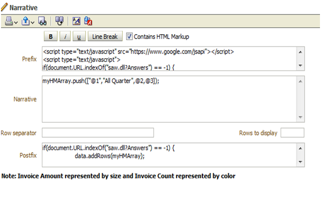
Narrative View
Prefix
|
<script type="text/javascript" src="https://www.google.com/jsapi"></script>
<script type="text/javascript">
if(document.URL.indexOf("saw.dll?Answers") == -1) {
google.load("visualization", "1", {packages:["treemap"]});
google.setOnLoadCallback(drawHMChart);
}
function drawHMChart() {
if(document.URL.indexOf("saw.dll?Answers") == -1) {
// Create and populate the data table.
var data = new google.visualization.DataTable();
data.addColumn('string', 'Quarter');
data.addColumn('string', 'Parent');
data.addColumn('number', 'InvoiceAmt');
data.addColumn('number', 'InvoiceNum');
myHMArray=[];
myHMArray.push(["All Quarter",null,0,0]);
}
|
Narrative
|
myHMArray.push(["@1","All Quarter",@2,@3]);
|
Row separator
|
Nil
|
Rows to display
|
Nil
|
Postfix
|
if(document.URL.indexOf("saw.dll?Answers") == -1) {
data.addRows(myHMArray);
// Create and draw the visualization.
var tree = new google.visualization.TreeMap(document.getElementById('div_Heatmap'));
tree.draw(data, {
minColor: '#f00',
midColor: '#ddd',
maxColor: '#0d0',
headerHeight: 15,
fontColor: 'black',
showScale: true});
}
}
</script>
<b>Note: Invoice Amount represented by size and Invoice Count represented by color</b>
<div id="div_Heatmap" style="width: 700px; height: 350px;"></div> |
Narrative View
Heat Map


